Creating the althaus brand
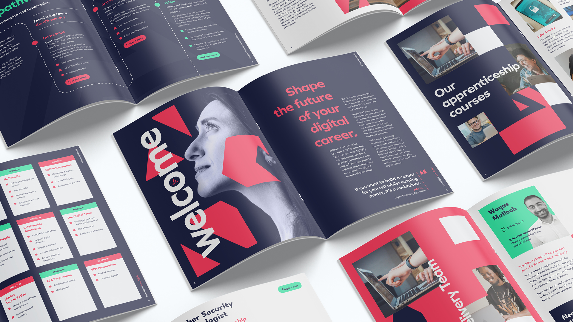
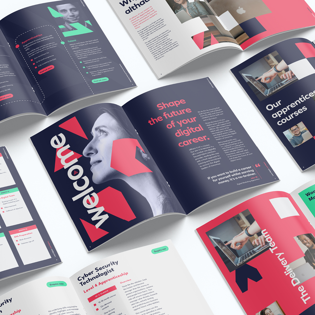
althaus Digital, a trailblazer in digitally focused talent solutions, embarked on a rebranding journey aligned to its mission of becoming the UK’s number one digital training provider. Rooted in innovation, quality, and inclusivity, the reimagined althaus brand seamlessly blends a modular, grid-based design system with a vibrant colour palette, creating a dynamic identity that resonates across all platforms.

The heart of the rebrand is the new logo, which has been designed to signify the building blocks of knowledge. The modernised core colours – a revitalised blue representing trust and expertise, and an invigorated green embodying growth and innovation – infuse the logo with energy and purpose.
althaus’s rebrand incorporates a modular grid system that serves as a canvas for collaging images across multiple platforms, from the website to printed marketing materials. Carefully selected imagery showcases the wide range of learners that althaus supports, from aspiring tech professionals to forward-thinking future business leaders from all backgrounds.


The brand’s messaging resonates with a tone that’s both aspirational and accessible. althaus aims to bridge the UK’s skills gap, by providing training opportunities, through apprenticeship programmes and bootcamps, to meet the needs of businesses both now, and in the future. The language empowers learners and inspires employers, and the combination of clear, concise messaging and engaging visuals showcases althaus’s unique offering and transformative impact in uncovering the digital leaders of tomorrow.